IT
  
Attualmente si sta visualizzando la versione Italy del sito.
Volete passare al vostro sito locale?
42 TEMPO DI LETTURA MIN

Shape and suggestion

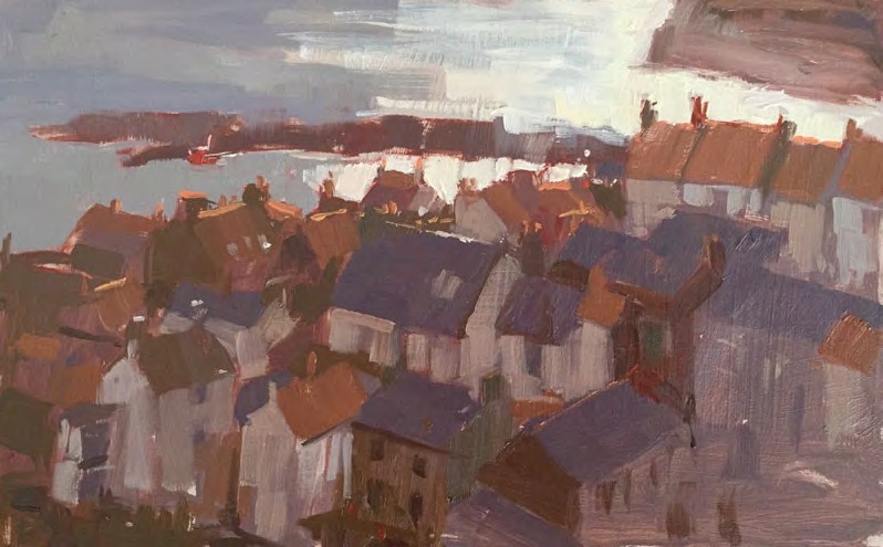
Rooftops, Staithes, oil, 5×9in (12.5×23cm).

This is a situation where the suggestive approach works so well. The first and strongest shape I noticed was the shape made by the glare of the light on the water, both in the harbour and beyond. By squinting I could see that the buildings were massed together as a silhouetted shape against the light value of the water. Rather than think about individual shapes of buildings, I observed the outline made up by their rooftops. I blocked in a general dark colour to cover the whole of the village, which I judged to be an approximation of the warm dark colour I could see when I screwed up my eyes – purplish to brownish because of the mix of slate and terracotta rooftops. Then I only had to suggest some individual rooftops with smaller shapes and more specific colours, keeping everything within the darker band of values. I also felt that I needed to make a distinction between the white and the red buildings – in the detailed section you can see how much darker the value of the white buildings in the shade is compared to that describing the low morning sun on the water. The sun was rising rapidly as I painted, revealing more information and colour in the scene before me so I tried to keep a clear vision of what I saw when I first started the painting. I added a few highlights to pick out individual rooftops and details of chimneys. If I had attempted this painting in a linear way by first drawing outlines of all the buildings, it would have taken far too long and there’s no way I could have achieved this effect of the light, which is what I was after

Leggete l'articolo completo e molti altri in questo numero di The Artist
Opzioni di acquisto di seguito
Se il problema è vostro, Accesso per leggere subito l'articolo completo.
Singolo numero digitale Aug-17
 
€6,99 / issue
Questo numero e altri numeri arretrati non sono inclusi in un nuovo abbonamento. Gli abbonamenti comprendono l'ultimo numero regolare e i nuovi numeri pubblicati durante l'abbonamento. The Artist
Abbonamento digitale annuale €47,99 fatturati annualmente
Risparmiare
43%
€4,00 / issue
Abbonamento digitale mensile €5,99 fatturati mensilmente
Risparmiare
14%
€5,99 / issue
ABBONAMENTO ALLA STAMPA? Disponibile su magazine.co.uk, la migliore offerta di abbonamento a una rivista online.
 

Questo articolo è...


View Issues
The Artist
Aug-17
VISUALIZZA IN NEGOZIO

Altri articoli in questo numero


The Artist
WELCOME From the editor
Email me at theartistletters@tapc.co.uk, or visit our
YOUR VIEWS
Letters, emails and comments
Summer subscriber OFFERS
The Artist print edition comes direct to your home
THE ARTWORLD
NEWS, VIEWS, INFORMATION AND SPECIAL EVENTS IN THE ART WORLD
Go back to basics with Leisure Painter
Celebrating our 50th year, Leisure Painter is the UK’s
FEATURES
A head for heights
Janet Kenyon tells Susie Hodge how she captures both natural and artificial light and achieves her multi-layered style in her award-winning watercolour paintings
Brushes and canvas
Ian Cryer, president of the Royal Institute of Oil Painters, shares his thoughts on canvas and brushes, how one affects the other and how his techniques have developed over the years
Charles Williams’ musings: GALLERIES and COLLEGES
Charles Williams NEAC RWS Cert.RAS is a painter, writer
ADE BANJI ’ S MOTIVATION L TIPS Dream big
Whatever stage you are on your journey of being the creative person you really want to be, there is always room for improvement, says Adebanji Alade
PRACTICALS
Flower painting in mixed media
Aine Divine demonstrates a mixed-media painting of flowers – it was so much fun to do that she urges you to have a go
Selfies
In this series, Phil Tyler has explored a variety of different approaches to drawing and painting the figure. The selfie is an opportunity to re-explore these approaches more fully, and he has some interesting ideas for you to try
How to paint realistic seacapes in acrylics
Jo Quigley reveals her systematic approach to painting realistic seascapes in acrylic
Consistent, creamy colour
Liz Seward says that working with Caran d’Ache Museum Aquarelle Pencils was one of the ‘the best painting experiences I’ve had for a long time – I love these pencils!’
Negative painting
Paul Riley begins a three-part watercolour course with a look at some of the ways to achieve negative shapes, and their importance
Street life
David Questa reveals how he expresses movement and energy in his plein-air drawings of busy city streets
Summer trees and foliage in watercolour
Judi Whitton urges you to try a new approach to the way you paint summer trees and foliage to allow your paintings to become more exciting and original
Depth and flatness: putting perspective into perspective
Martin Kinnear brings his series to a close with some useful advice about atmospheric and linear perspective and a look at the alternatives, such as flat pattern
Woods and water
Barry Herniman shares the contents of his plein-air sketching kit – one that sees him well placed for a day’s sketching as he gathers material for a watercolour painting
Warm versus cool
This month Paul Talbot-Greaves demonstrates how you can add impact to your painting by using warm and cool contrasting colours and sets this month’s challenge for you to submit for appraisal
THE A-Z OF COLOUR
Julie Collins explains why value is so important in your painting and explains how to make a value scale
PLUS
ART BOOKS & DVDS
This is a major publication. The Arctic is one of the
OPPORTUNITIES & COMPETITIONS
Check out the latest competitions to enter and make a note of important deadlines
EXHIBITIONS
GALLERY OPENING TIMES AND EXHIBITIONS DATES CAN VARY; IF IN DOUBT, PHONE TO AVOID DISAPPOINTMENT