US
72 MIN READ TIME

Inspired by the railways

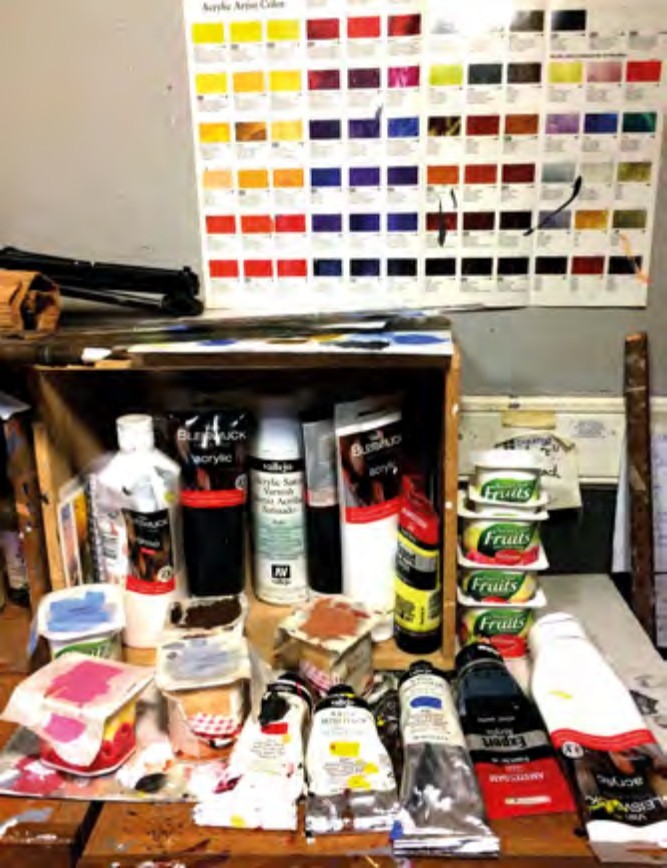
Painting materials in the newly installed wine boxes. I made a point of collecting a number of wine boxes from boot sales and supermarkets and using them as a storage facility in the studio. This picture is typical of the state of things when paintings are in progress (most of the time).

The term ‘poster-like’ paintings most often refers to the posters issued by travel companies in the inter-war period, 1923 to 1940. Although shipping companies, and later airlines, also used large colourful posters to advertise their destinations, it was the railway posters that most captured the public’s imagination. Until 1923, the railways of Britain comprised scores of small companies that ran services all over the country. In 1923, the railways were grouped into four major companies, each covering a specific section of the country but with some overlap to encourage competition. These companies, known as The Big Four, were the London and North Eastern Railway (LNER), the London, Midland and Scottish Railway (LMS), the Great Western Railway (GWR) and the Southern Railway (SR). The competition thus created motivated the companies into improving their advertising and the railway poster as we know it was born.

Initially, graphic and commercial artists were employed to create designs but better-known artists of the period, including many Royal Academicians were soon added. The brief was simple: a large, colourful picture showing the best features of a certain town or region, which could be seen from a distance. These paintings, however, had to conform to the technical and printing limitations in force at the time. This meant no shading, airbrushing or tonal variations. Only flat colours were permissible and a limited number of colours at that. The number of colours used depended on the importance of the poster, the size of the print run and the budget. A poster advertising the coronation in 1937, for example, might warrant up to 12 colours whereas a poster for a small seaside town in an obscure part of the country might only justify four colours. Five to eight colours were the norm for most posters. The process was by simple lithography on stone blocks, which meant each colour had to be applied separately. Each colour, therefore, incurred a cost so the fewer colours used, the less expensive the print run.

Read the complete article and many more in this issue of Leisure Painter
Purchase options below
If you own the issue, Login to read the full article now.
Single Digital Issue May-19
 
$5.99 / issue
This issue and other back issues are not included in a new subscription. Subscriptions include the latest regular issue and new issues released during your subscription. Leisure Painter
Annual Digital Subscription $39.99 billed annually
Save
44%
$3.33 / issue
Monthly Digital Subscription $4.99 billed monthly
Save
17%
$4.99 / issue
PRINT SUBSCRIPTION? Available at magazine.co.uk, the best magazine subscription offers online.
 

This article is from...


View Issues
Leisure Painter
May-19
VIEW IN STORE

Other Articles in this Issue


Leisure Painter
Welcome from the editor
With spring just around the corner, many of us are
IN EVERY ISSUE
Diary
THINGS TO DO THIS MONTH
Exhibitions
JANE STROUD RECOMMENDS
Letters
SHARE YOUR TIPS, SUGGESTIONS, IDEAS AND QUESTIONS WITH OTHER READERS
Books
WHAT TO READ THIS MONTH
Art clubs
OVER TO YOU FOR THE LATEST NEWS ON CLUB EXHIBITIONS AND ACTIVITIES
Online gallery
Jane Stroud selects artwork from our PaintersOnline gallery WWW.PAINTERS-ONLINE.CO.UK
FEATURES
Watercolour magic
Rediscover the magic of day-to-day objects and paint what’s in your kitchen cupboards, with Adrienne Parker
Painting project
Part 1 Here are your first steps to painting an avocet in acrylics, with Jackie Garner
Painting project
Learn how to adapt your reference material as you follow Jem Bowden step by step to paint an iconic coastal scene
Painting project
Part 2 How to paint a portrait of an eagle owl without becoming overwhelmed by the detail, with Kerry Bennett
Figure it out
Stephen Coates offers 12 confidence-building exercises to help you draw figures and populate your paintings
Studies in the landscape
Part 5 Anne Kerr continues her six-part series, demonstrating how to draw skies, water and land then sets you a challenge for the coming month
Signs of spring
Develop confidence and skills as you paint an experimental study of loose and lively flowers in watercolour, with Fiona Peart
Aspects of acrylics
Part 3 Paint along with Steve Strode as you practise a plethora of techniques for painting a coastal scene
Animals from life
Part 3 How to add a splash of colour to your sketches, by Liz Chaderton
Interlude
Paint a serene seascape using just three colours, with Elena Parashko
Coloured pencil basics
Part 5 How and when to use water-soluble pencils along with solvents for your coloured-pencil work, by Judith Heilbronn Crown
Portrait of a cat
Build your watercolour confidence as you paint a portrait of a cat in sunlight, with David Webb
Let’s start with Art
Part 5 Linda Birch demonstrates confidence-building exercises to help you draw with pen and ink