PRINT AND PATTERN
From humdrum to harmonious – Pippa Jameson shares tips on styling a statement scheme with standout shapes
1 Muted graphics
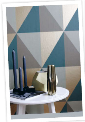
Twinkles of metallic gold elevate the look, and give it an air of warmth
Bold needn’t mean brash – opt for pared-back, soothing tones to set the scene for a serene wind-down zone that’s animated yet 100% zen
Fancy pinching this look for your own place? Start with a statement wallpaper, but stick with a strong print in a soft palette to keep the room feeling cosy and snug.
Cool blues and sea greens keep the scheme calm – the pattern adds drama
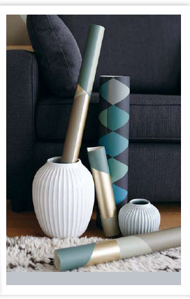
Steer clear of garish brights – this scheme is all about calm and relaxation. Shopping for graphic papers? Try Wilko and B&Q for a few bargain options, and nip over to Habitat to browse its range of vases, candleholders and cushions – you’ll be spoilt for choice! When papering your walls isn’t an option, consider covering your sofa with a printed throw in an eye-grabbing design, still keeping the trimmings subtle. Or, buy bargain poster frames from Ikea and display large lengths of paper for a similar effect with half the handiwork.