SHOOT COOL COLOURS
Higher Kelvin colour values ensure that your images have a full tonal range
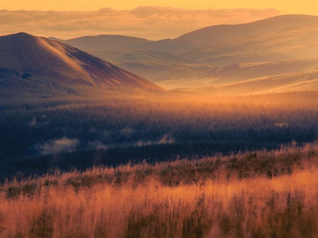
THE FULL RANGE Even during the golden hours, it’s necessary to select a custom white balance setting to retain some cooler tones, as in the shadows here. Without this contrast, images can seem flat
© Peter Fenech
Humans tend to respond positively to warmer reds, H yellows and oranges, probably because we see them as indicators of a comfortable environmental temperature. There’s also the effect of skin tones on the perception of health and vitality – blue skin rarely suggests either of these. However, this can lead to photographers developing a mild fear of cooler tones in images, or generally forgetting to give them room to breathe. At the least, we should allow natural blues and cyans to balance the hues at the opposite side of the colour wheel.