POP ART
SO MANY ALBUMS FROM 1981 REMAIN CLASSICS TO THIS DAY, YET THE STORIES BEHIND THE CREATION OF THEIR COVER ART REMAIN LARGELY UNTOLD. LET’S OPEN UP THOSE GATEFOLDS AND SLIDE INSIDE THE SLEEVES OF SOME OF YEARS’ SMARTEST DESIGNS TO EXPLORE THE ART BEHIND THE ARTISTS OF 1981…
ANDREW DINELEY

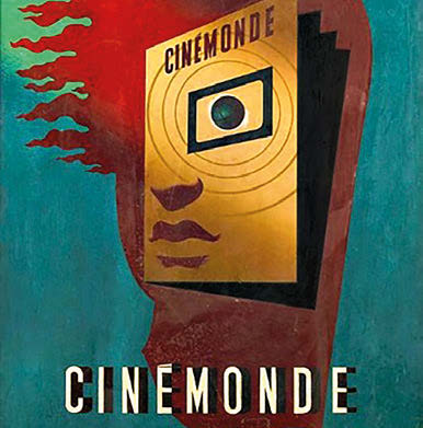
Above: Peter Saville’s design for Ultravox’s Rage In Eden caused a stir when it was discovered that it was a lift of a 1930s work by French painter Hervé Morvan. Left: more artistic appropriation with Saville’s Depero-referencing design for Movement
Amongst the artists who upheld a flawless standard for graphic design in the 80s, Peter Saville is one of the best-known – so let us begin by opening up the portfolio of the man who by 1981 had already begun to influence the whole aesthetic of the era…
A NEW FUTURE
Peter Saville had been solely responsible for the sleeve of almost every Factory Records release from its outset in 1978. In 1981, after the demise of Joy Division, New Order was born, and for their debut album Movement, Saville appropriated Futurist artist Fortunato Depero’s design work for a journal cover titled Futurismo. Saville’s typographical homage did incorporate some subtle changes: for example, he adapted the original’s angular elements to form an ‘F’ (for Factory) and an ‘L ’(50 in Roman numerals). However, the source of the sleeve served to further feed the erroneous conspiracy theories that had previously plagued Joy Division; as beautiful as the design work of the Futurists may have been, the movement was infamously aligned with extreme rightwing politics, and this brought up allegations that Factory was possibly flirting with the dark side.
For Ultravox’s Rage In Eden, Saville’s penchant for visual appropriation of historical classics caused controversy of a different kind. He again selected an iconic work, this time a 1930s poster by French artist Hervé Morvan, and as with New Order’s debut he replaced the original work’s title with that of the band, also applying his own more muted colour palette.
Unfortunately the changes were not enough to distance the sleeve from the original. Morvan’s estate was not pleased to see the iconic pieces being recycled without permission, so the Ultravox sleeve was quickly replaced – only to reappear in 2008 when the album was reissued.

Left: the Saville/Wickens design for Architecture & Morality, with pictures by Brett Wickens’ friend Robin Roddey, who at that point was working as a forensic photographer for the Toronto Police Department

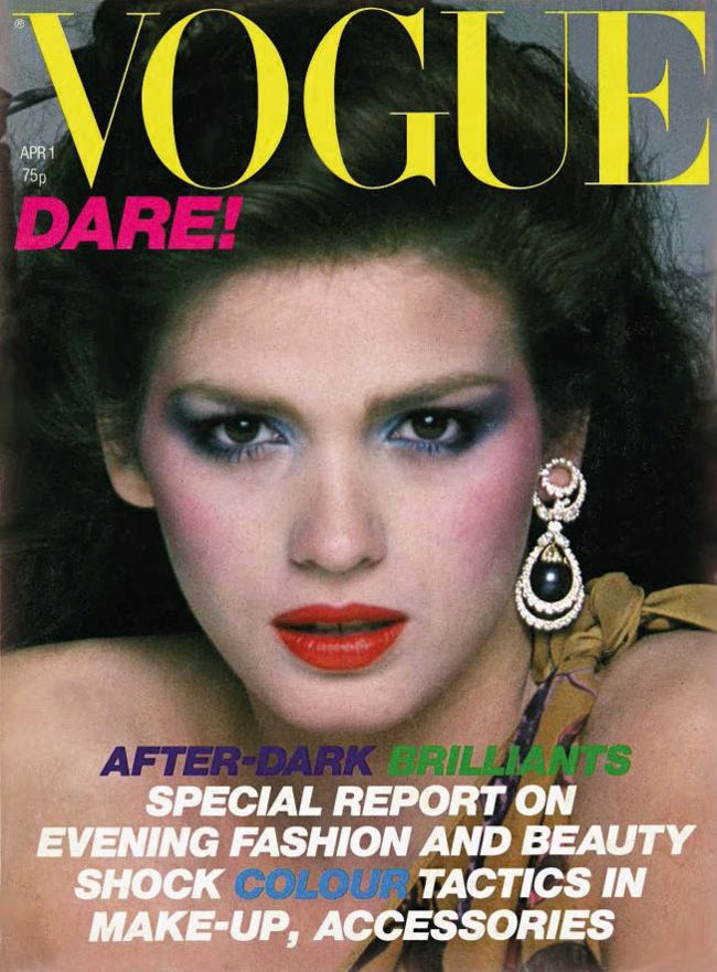
Right: the Vogue cover with its one-word tagline that inspired the title – and the typography – for The Human League’s allconquering 1981 album.