DESIGN NOTES
Colour coded
From earth-inspired tones to nostalgic brights, the three Dulux colour palettes for 2026 reflect a desire for calm and connection.
STORY Holly Byrne
STYLING Bree Banfield | PHOTOGRAPHY Lisa Cohen
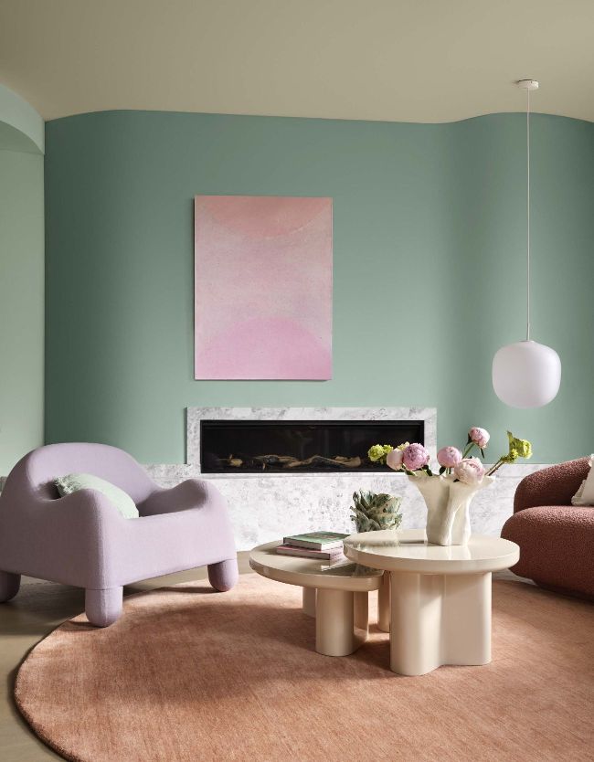
ETHEREAL NOTES
From the Ethereal pallete, walls here are painted Dulux Tiamo and Dulux Soft Fresco. Ceiling painted Dulux Lilium Two. Armchair, Cult Design. Cushions, Aura Home. Round Rug, Tallira. Artwork by Peter Summers. Coffee Tables, Trit House. Vessels, Craft Victoria. Lamp, Amy Voterakis. Sofa, Stylecraft.
Colour trends come and go, but they also act as a social barometer. As we approach 2026, the hues we’re drawn to mirror the rhythms of modern life: a craving for calm, the pull of comfort and the hope of renewal. But what’s in a colour? So much more than pigment splashed on plaster.
When it comes to paint, colour shapes how we express ourselves in our homes. After years of minimalism and restraint, it’s time to embrace more moving palettes. Whites are softening and neutrals are deepening, overall warming up our walls.
“Our palettes for 2026 respond to the times,” says Lauren Treloar, colour and design manager at Dulux Australia.
“People want warmth, familiarity and optimism. We’re seeing hues that nurture wellbeing and provide connection.”
In the Dulux Colour Forecast for the year ahead, three key moods are emerging. Together they form a portrait of how we want to live, not just what we want to look at. “There’s a collective move towards warmth and meaning,” says interior designer Greg Natale. “People want rooms that hold them, not just impress them.”
We spoke with leading voices in design and colour to uncover how these palettes can go beyond the swatch, transforming walls into spaces that feel personal and alive with possibility.