POP ART
BY 1983, MANY CLASSIC POP ARTISTS OF THE 80S WERE SETTLING INTO THE MAINSTREAM, PERFECTING THEIR SOUND USING BOLD AND BRAVE VISUALS TO PACKAGE WHAT WOULD BECOME SOME OF THE BEST ALBUMS OF THEIR CAREERS
ANDREW DINELEY
Graphic designers were often an integral part of the team for pop stars in the 80s. This mutually beneficial business arrangement allowed designers to use an artist or act’s high profile as a commercial platform for their visuals, and pop stars in turn would have access to a uniquely bespoke style that was consistently applied in the hands of a trusted creative confidante.
When the Thompson Twins re-emerged in 1983 as a slimmed down trio, their commercial pop ambitions were deftly co-ordinated from a visual perspective by graphic artist, Andie Airfix of Satori Design. He worked closely with the Twins’ Alannah Currie on a graphic identity that would effectively consolidate the trio’s ambitions to break into the mainstream. As intended, the album Quick Step & Side Kick propelled the trio from the indie fringes into the pop charts and design was integral to this success.
HANDY ANDIE
Andie Airfix sadly passed away in 2018 but in his blog, he provided some insight into how the album’s sleeve artwork came to fruition: “Pete Winkelman from Arista Records showed me all the photographs taken for the album which had been rejected by the band. I realised that the photographer may have dismissed photographs for the wrong reasons. An album sleeve is not just about a photograph – it’s about a combination of elements. I could see why the picture had been rejected – the band were weirdly off-centre and Joe had been cropped in half on the left of the shot. However, it was a great picture and I could see that the addition of graphics would make it work. Creating the logo, using the same colours as the basis for the graphics and using the border so Joe’s image wasn’t falling off the edge of the sleeve, everything fell naturally into place.”
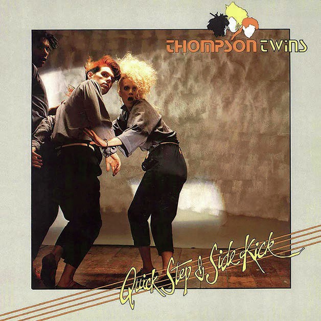
Quick Step & Side Kick was the Thompson Twins’ third studio album

Andie Airfix designed the iconic Thompson Twins logo by manipulating the three members’ heads and haircuts from the front cover of Quick Step & Side Kick
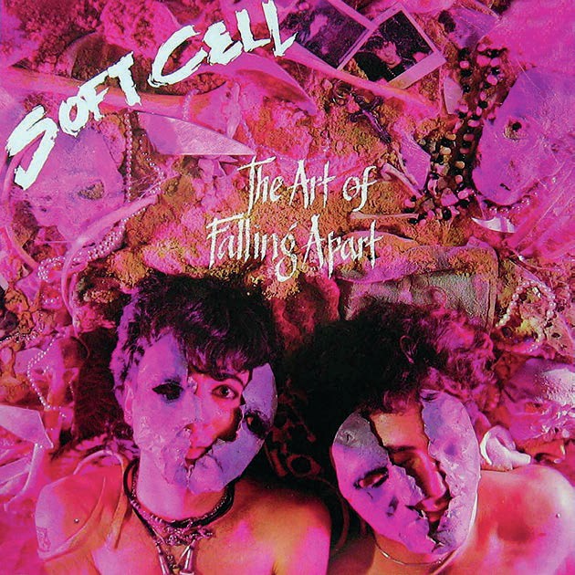
The Art Of Falling Apart was Soft Cell’s second album, peaking at No.5
The album’s photo session also informed Andie’s design of the Thompson Twins’ logo. The cover shot provided an outline reference for Alannah Currie and a shot that was used for the album’s lead single Lies was used for Joe Leeway and Tom Bailey in their now instantly recognisable logo.
Marc Almond and Dave Ball were both art students themselves when they formed Soft Cell and from the start worked closely with their friend and designer Huw Feather who created logos and illustrations for the duo and oversaw art direction duties. In 1983, for their second album, The Art Of Falling Apart, Peter Ashworth was commissioned to shoot the sleeve image. Huw Feather: “The cover of this was a team effort, we built a large sand pit and filled it with interesting ephemera that would make a great background for Peter Ashworth to shoot them lying down on. The myth that Dave slept through most of this shoot is true, it wasn’t called The Art Of Falling Apart for nothing!”