POP ART
BEGINNING BY ENLISTING THE SUPPORT OF TALENTED FRIENDS, DEPECHE MODE BEGAN TO DEVELOP A DESIGN AESTHETIC TO MATCH AND OFTEN UNDERMINE THE SUBJECTS TOUCHED UPON IN THEIR MUSIC. SOON, THE BAND MOVED ON TO JOIN FORCES WITH SAVVY VISUAL COLLABORATORS TO PLAY WITH THE SIGNS AND CODES OF MODERN SOCIETY. IT WAS A JOURNEY THAT WOULD TAKE IN CATS, EGGS, FLOWERS… AND A THING WITH FEATHERS
ANDREW DINELEY
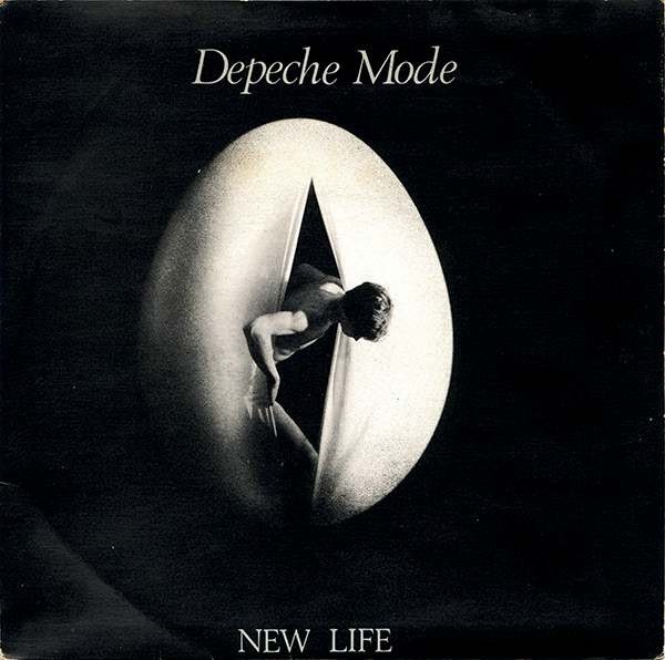
Depeche Mode’s debut single, Dreaming Of Me b/w Ice Machine, carried a sleeve design by Martin Gore’s friend Mark Crick. Right: New Life, released on 28 May 1981, featured a figure emerging from a fabric egg
Neville Brody’s Just Can’t Get Enough sleeve expanded upon the New Life 12” cover with a negative image of a bound and blindfolded figure. Far right: Brody appropriated a photo of a cat from an advert by the Bradford carpet company Kosset for the 7” version, upping the contrast to introduce an unsettling effect
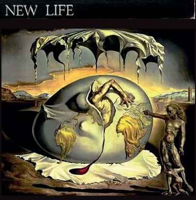
The Salvador Dali painting, emblematic of new forces emerging from the Second World War, that inspired the New Life sleeve

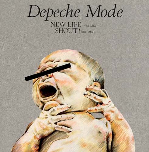
The 1968 Mind Alive magazine cover shot that Simon Rice re-drew for the 12” single version of New Life, with the baby’s eyes obliterated by a black censor bar
Depeche Mode’s 1981 debut single set an important visual trend for the band that would endure to the present day, with the band almost always opting out of appearing on their sleeves. Vince Clarke’s opaque lyrics probably didn’t help influence their early sleeve designs, so Dreaming Of Me instead featured an ambiguous illustration of four diminishing, identical figures. This uncredited work was by Mark Crick, a schoolfriend of Martin Gore, who would go on to find acclaim as an author and photographer. This deliberately obscure, almost Delphic design heralded the visual birth of Depeche Mode, who would go on to embrace the best talent from the worlds of design and photography. In this Pop Art feature we look back at some remarkable examples from a visual portfolio spanning more than three and a half decades…
NEW LIFE, NEW LOOK
Depeche Mode’s chart breakthrough single New Life heralded what would become another tradition for the band – singles with unique sleeve designs for their 7” and 12” formats. The New Life 7” featured a moody black and white photograph by Rodney Martin, possibly of Dave Gahan emerging from a giant egg – a rather literal visual interpretation of the song’s title and an homage to a 1943 painting by Salvador Dali entitled Geopoliticus Child Watching The Birth Of The New Man. The theme was alternatively explored by Simon Rice with his illustration for the 12” single – a reworking of a 1968 cover image from Mind Alive magazine featuring a crying baby with its eyes alarmingly obscured by a black bar. If the lyrics were confusing, these images only added to the mystery.
Just Can’t Get Enough saw Depeche Mode finally break the UK Top 10, and its two sleeves – designed by notable graphic designer Neville Brody – took the band in another visual direction. The results, particularly in the 12” format, were considerably more challenging than the commercial pop tune they packaged, with a grainy, manipulated cover image depicting a bound and blindfolded figure starkly in contrast to the song itself. The 7” sleeve variant featured a fluffy white cat, an image appropriated from another vintage magazine, this time an advert for Kosset carpets.
That same year Depeche Mode’s debut album appeared with a sleeve that again confounded its audience. Speak & Spell, with Brian Griffin’s brooding photograph of a nesting swan in a plastic bag, wickedly belied its pop contents. “Brian Griffin did the photography,” confirmed Daniel Miller. “Before we met, I’d been a fan of his work with artists like Devo and Siouxsie. The photograph divided people – I’ve no idea what it means, and I’m not sure that Brian does either!” Brian Griffin would go on to create many more images for the band.