GB
  
You are currently viewing the United Kingdom version of the site.
Would you like to switch to your local site?
10 MIN READ TIME

Painting Project

Part 2 Follow Kerry Bennett step by step as she paints three ostriches from three photographs – and discusses three different background techniques

LEARNING OBJECTIVES

How to prepare for a painting, using masking fluid and wet-in-wet background

Practise wet-in-wet, wet-on-dry and dry-brush techniques

Having covered the preparation of an outline (bottom right) in part one last month from three photographs (below right) we have one more step to make before we begin painting. To protect the pencil lines from the paint temporarily, masking fluid needs to be applied to the outline of each ostrich. I did this using a blending tool with a silicone tip, but you can also use a brush or cotton bud to produce a thick outline. Mask the ostriches out completely if you wish; this will allow you to be freer when applying the wet-inwet background.

I then used a ruling pen (or you can use any object with a point) to flick the line of masking fluid whilst it was still wet, in preparation for the fluffy white feathers that will catch the light around the edges of the ostriches. In this way you will be able to complete the background first, using a lot of water and paint to achieve a nicely blended wet-into-wet effect.
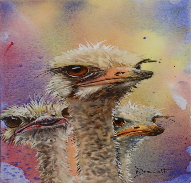
Ostriches II, watercolour, 12x8½in. (30x22cm). For this painting I used Round brushes Nos. 10, 4 and 1, and a very liquid, wet-in-wet approach.
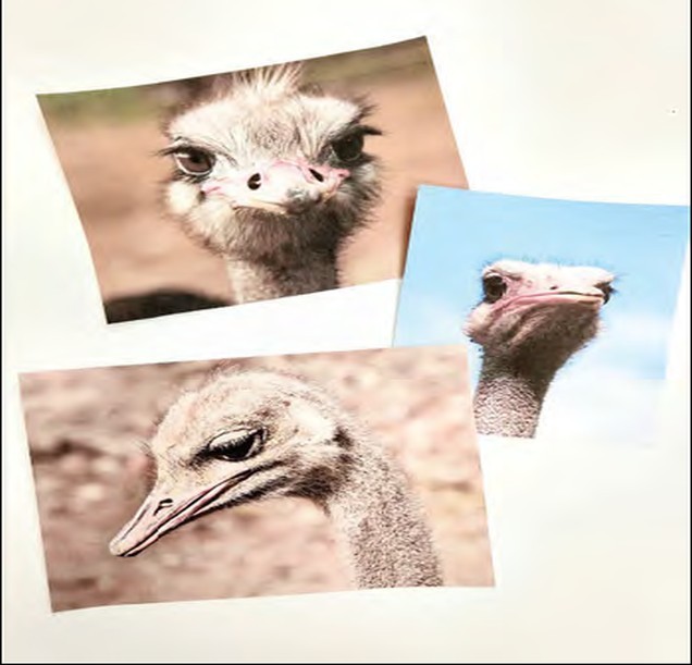
The three photographs introduced in last month’s issue (thanks to www.pixabay.com)
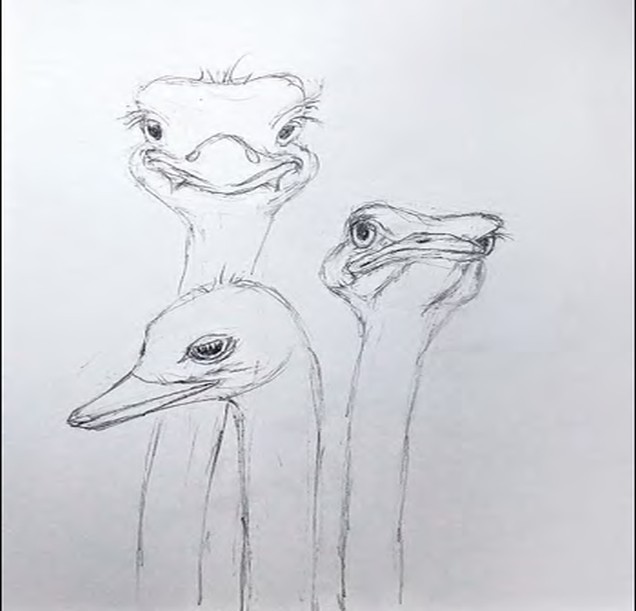
The finished drawing

MASKING FLUID TIP

If using a brush, dip it in washing up liquid first (or a soap bar with a wet brush), pat the excess off then dip straight into the masking fluid. This will keep your brush usable for the next time, but still make sure you use an old brush.

Wet-in-wet backgrounds

For the following demonstration painting I used a simple technique to paint the background; you will find this method described in Step 1. Before I completed the painting, I also experimented with different background colours, which you can see in Ostriches I (right). Here I used Payne’s grey mixed with olive green and a touch of green gold, followed by burnt sienna, yellow ochre and ultramarine, and a touch of cerulean blue at the top. I began by masking the ostriches, using the ruling pen for the feathers around the edges, giving them a little flick to achieve fine lines and pointed tips. I also flicked a few drops of fluid here and there to create interest in the background.

Read the complete article and many more in this issue of Leisure Painter & The Artist
Purchase options below
If you own the issue, Login to read the full article now.
Single Digital Issue Dec-19
 
£5.99 / issue
This issue and other back issues are not included in a new subscription. Subscriptions include the latest regular issue and new issues released during your subscription. Leisure Painter & The Artist
Annual Digital Subscription £59.99 billed annually
Save
37%
£5.00 / issue
Monthly Digital Subscription £6.99 billed monthly
Save
13%
£6.99 / issue
PRINT SUBSCRIPTION? Available at magazine.co.uk, the best magazine subscription offers online.
 

This article is from...


View Issues
Leisure Painter & The Artist
Dec-19
VIEW IN STORE

Other Articles in this Issue


Leisure Painter
Welcome from the editor
With the nights drawing in and more time spent painting
IN EVERY ISSUE
Diary
THINGS TO DO THIS MONTH
Exhibitions
JANE STROUD RECOMMENDS
Letters
SHARE YOUR TIPS, EXPERIENCES, IDEAS AND QUESTIONS WITH OTHER READERS
Books
WHAT TO READ THIS MONTH
Art clubs
OVER TO YOU FOR THE LATEST NEWS ON CLUB EXHIBITIONS AND ACTIVITIES
Art club gallery
BEST IN SHOW PAINTINGS
Online gallery
Jane Stroud’s selection of works from our PaintersOnline gallery www.painters-online.co.uk
FEATURES
Photo finish
How to choose, manipulate and paint successfully from photographs, by Andy Walker
’Tis the season
Part 1 Brian Smith chooses festive subjects to discuss some of the factors that help you to describe form
Back to basics: portraits
Mix effective skin tones and paint a wet-in-wet portrait using a limited palette – with tips and ideas on drawing accurate features, by Shelagh Ashley
A medium for all seasons
On the hunt for views of Derbyshire over a full year, Richard Holland discusses the colours and techniques he uses to paint local scenery in oils
Backlit lily
How to paint a delicate pale flower against a darker background, by Jackie Barrass
Autumn fox
Paint a loose and lively rendition of a fox’s head against a misty, wet-in-wet background, by Alison Fennell
Alice draws the line
Part 2 How to paint a pine cone in line and wash from life, with Alice Savery
Let’s start with art
Part 13 Linda Birch concludes her series of introductions to different media with a look at how to work with gouache
OFFERS, NEWS AND COMPETITIONS
A subscriptio subscription saves you money and makes a GREAT GIFT
A SUBSCRIPTIONFOR YOU SAVE OVER 30%on the shop price
Making arrangements
Part 2 David Webb takes you through the process of painting a still life using just four colours
Tone and shade
How to work with the dynamic effect of tone and shade to bring your landscapes alive, by Tony Hogan
Best in show
Follow Elena Parashko step by step as she takes you through the painting of a portrait of two dogs
Take three colours
Learn how to work with a limited palette before depicting stonework, trees, rocks and reflections in a single painting, by Stephen Coates
OFFERS, NEWSANDCOMPETITIONS
Try a new reading experience
See for yourself DOWNLOAD THE FREE SAMPLE ISSUE NOW!
TAKE THREE COLOURS
START TO PAINT WITH 3 COLOURS, 3 BRUSHES AND 9 EASY PROJECTS
Chat
X
Pocketmags Support