NEW SERIES!
CAMERA CLINIC
Master the art of modern photography
This month: Get colours right
Expert hints and tips on how to get perfect colour every time, in every situation
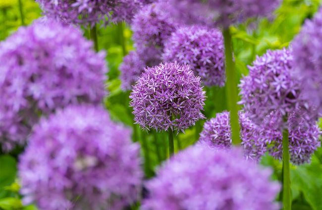
Lifelike colours and nature photography go hand in hand.
Will Cheung
Will Cheung
An imaging journalist and freelance photographer based in London, Cheung has a wealth of experience over several decades. www.williamcheung.co.uk
Our advanced digital imaging devices make capturing colour pictures so simple that they can be mostly left to their own devices. Light passes through the lens, is picked up by the sensor, analysed by the image processor using algorithms and artificial intelligence and the result recorded on a memory card. Whether that light is supplied by the sun, LED lamps or candles, the camera does a great job of delivering a decent result. Indeed, most of us are happy enough with the outcome and go no further.
However, for better photos, going further is part of the job. While the camera is a mightily effective machine, it can’t see what’s in your imagination; it has no idea what mood you want to portray and it doesn’t know whether you prefer vibrant colours or more muted hues. To achieve what you’ve visualised, it’s time to roll up your sleeves and get involved, but how deep that involvement is up to you.
Advanced and professional image makers will have a fully colour-managed workflow, but the good news is that enthusiasts can achieve a great deal without wandering too far into pixel-peeping territory. If you only shoot jpegs, you can still dig down into the camera’s menu and use white balance settings and picture styles for different colour renditions. Perhaps the best-known colour modes are Fujifilm’s Film Simulation settings, which are designed to give a colour performance akin to its popular films.
Shoot in raw format, and the potential for fine-tuning colour is huge, with editing software from Adobe, DxO, Skylum, Topaz and Zoner, to name just a few, providing almost endless opportunities to tinker with your photographs. Over the next eight pages, we will look at techniques and tools you can apply to get the ‘right’ colour and how you can use colour for pictures to be proud of.
Get the knowledge
Use your camera’s talents to capture correct colours
Before we dive into the detail, let’s define what we mean by ‘correct’ colour. Much depends on your perspective. A professional photographer shooting a royal blue bottle for a client needs to make sure that it comes out royal blue and not cyan or navy. A creative shooting a portrait, scenic view or interior will have different aims – looking for colours that portray the atmosphere, mood and emotion of the situation. Defining what’s wrong is often simpler than identifying what’s correct.
Photos with inappropriate colour casts due to using the wrong white balance setting or over-processing in software stand out – and not in a good way.
On the face of it, getting the correct colour sounds simple and it is, but there are still a few guidelines to follow.
Camera settings to use
Start your journey to great colour images with the camera’s menu
WHICH COLOUR SPACE?
Colour space describes the capabilities of a capture or display device to reproduce colour. sRGB has a smaller gamut (the number of colours that can be reproduced) but is wider than most inkjet printers and monitors. This is the best colour space for jpegs, but for images straight out of the camera, Adobe RGB’s wider colour gamut in greens and cyans is better. With raw files, colour space is decided when the file is outputted.