60 Objects, 60 Years
2013 to 2017: Royal Mail Stamps to New Mondasian Cyberman Costume
JAMIE LENMAN continues to catalogue one object for every year of Doctor Who’s existence – including props, collectables and mementos.
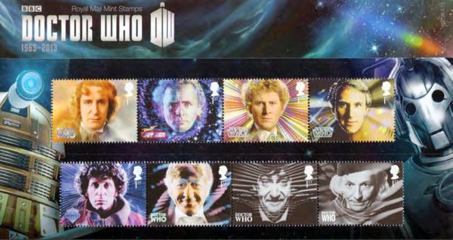
The front of the collector’s pack of the Royal Mail’s 2013 Doctor Who stamps.
2013 Royal Mail stamps
The year 2013 was huge for Doctor Who – the show that was only intended to run for 13 weeks had somehow made it through half a century. Among the myriad honours heaped upon it was a set of 16 stamps, one for each of the (then) 11 official incarnations of the Doctor, four for their best enemies, and one for the TARDIS.
Harry Edmondson, part of the GBH design group that put the set together, remembers the process with affection. “Everyone on the team had their own memories and experiences of Doctor Who,” he says. “What we loved was the association of different Doctors that people had over different generations. The Daleks certainly made an impression on me as a child, when I was introduced to the show by my parents, and I remember how [showrunner] Steven
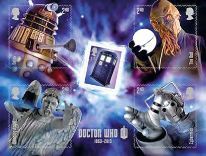
The Dalek, Ood, Weeping Angel and Cyberman stamps.
Moffat refreshed the show brilliantly with Matt Smith. These memories and personal associations led to us proposing the full set of Doctors and their title-sequence graphics, so you could pick your favourite – or the favourite of the recipient – and experience the visual evolution of the show in sequence.”
Inevitably, there are restrictions on what can be achieved within the confines of a 3cm x 4cm rectangle. “It’s such a tiny canvas that you have to approach the process in a very different way from more conventional design outputs,” Harry agrees. “Less is always more; simplicity is key!”
With the special monster stamps, however, there was a little more room for manoeuvre, as the Dalek, Cyberman, Ood and Weeping Angel appeared to be breaking the boundaries of their rectangular prisons. “We wanted the monsters to feel like they were chasing down the Doctor in his TARDIS, an ever-present circling threat that could strike at any moment, which is a central theme of the ongoing series,” explains Harry. “The stamps were specially die-cut, so when you placed them on a letter it appeared as though the monster was reaching out towards the viewer.” Of course, “reaching out” is at the heart of whole endeavour. “What I love most about design projects like these is that they touch so many people – and many more people can relate to what we do with something so tangible and in everyday use,” Harry says. “It’s always nice to have something tactile that you can hold and share with others. Receiving a letter with a tiny artwork on it, depicting a subject you love, is still a joy.”