WHAT’S NEXT FOR EVERYTHING APPLE IN 2020
Apple’s first virtual WWDC packed in a lot of announcements, big and small, for developers and the rest of us. Join us for a look at the highlights
Written by Adam Banks
Suffice to say, it’s been a pretty weird year, and despite the familiarity of sitting down to watch Apple’s Worldwide Developers Conference on live stream - after all, only a lottery-selected coterie ever got to attend in person - there was little sense of normality when Tim Cook walked out on stage in an empty Steve Jobs Theater. But what followed, in an impeccably produced two-hour keynote and more than 100 online video briefings, was a reassuringly Apple-like picture of progress, polishing and surprises.
By the time you read this, public betas of all OSes should be out (register at beta.apple.com), with full releases in the autumn, depending on hardware launches.
WHAT YOU’LL NEED >
macOS Big Sur
>MacBook (2015), MacBook Air (2013), MacBook Pro (Late 2013), Mac mini (2014), iMac (2014), iMac Pro, Mac Pro (2013) or newer
iOS 14 and iPadOS 14
>Any iPhone or iPad that could run iOS 13 or iPadOS 13
watchOS 7
>Apple Watch Series 3 or later
tvOS 14
>As for tvOS 13, an Apple TV HD (aka 4th gen) or Apple TV 4K
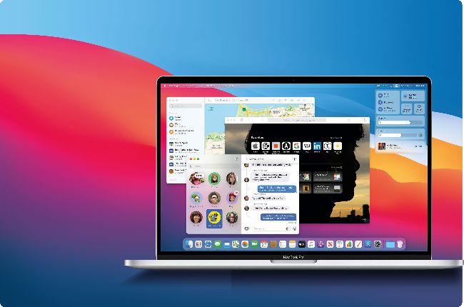
macOS Big Sur
If you thought Catalina brought big changes, you ain’t seen nothing yet
1 Default apps
Default apps including Maps and Messages have been completely rewritten, using Apple’s expanded Mac Catalyst development software, to add more features and align with their iOS and iPadOS versions.
2 Transparency effects
macOS Big Sur uses more transparency effects, applying these to windows by a more efficient and reliable method.
3 Menu bar
Can you spot what’s different about the menu bar? (Spot the new icon, explained right). The designers have sweated the small stuff to polish every detail in Big Sur.
4 Foating panels
The Dock and Notifications panels now float freely rather than being tethered to the edges of the screen, a subtle but symbolic progression from a rigid desktop interface.
A new look for your Mac
> Alan Dye, who joined Apple in 2006 from a background in branding and fashion, has taken over human interface design from Sir Jonathan Ive. He and his team have tweaked macOS with two perhaps conflicting aims: to improve consistency across all of Apple’s OSes and to ensure your Mac feels like a Mac. App icons now sit within a squircle and share symbols with iOS and iPadOS, but depart from the flat look introduced in iOS 7 with “highly crafted” shading. Aiming for “reduced visual complexity to keep the focus on users’ content”, buttons and tools recede to grey when inactive but make more use of colour, while text has been respaced. Even sounds are remastered.
New directions for Apple Maps
>
The bigger your screen, the better it shows off Apple’s cartography. On the other hand, you’re unlikely to wander the streets peering at your iMac, and perhaps for that reason the Maps app in macOS has been somewhat neglected.
In Big Sur, however, Apple has used Mac Catalyst to rewrite the app with more of the functionality of the iOS and iPadOS versions, including Favourites and the ability to see friends’ locations when they share their ETA. Look Around, the equivalent of Google Street View, is now included, and for pre-trip preparation you can compile and share your own Guides. Route planning gains calculations for electric vehicle charging stops, and you can take advantage of an increasing amount of mapping for indoor spaces such as airports.
Control Centre
>
In a clean-up of the right-hand end of the menu bar, a brand new icon invokes Control Centre. This long-awaited macOS equivalent of the iOS and iPadOS feature (invoked by swiping down from the top right) provides an instantly accessible group of system settings.
You can customise it with whatever options you use the most, from Bluetooth to brightness, and even control music playback. System Preferences still exists, but you’ll be using it less in Big Sur.