A CONVERSATION IN COLOUR
The hues of an F1 racing car have a single job – to instantly grab your attention. Damien Smith speaks to the master of liveries Peter Stevens about his designs for Brabham, RAM and Williams and which of today’s schemes delight or depress
Are racing car liveries as cool and memorable as they used to be? Let’s ask a man who should know. The trouble is, any conversation with Peter Stevens, the eminent designer behind some of the best, can never be linear or simple – which is kind of ironic given how ‘simple’ is a recurring theme that we keep looping back to.
A chat with Stevens is always colourful and you never quite know where he’ll go next. He’ll divert to tell you what he thinks of the new generation of LMDh/GTP sports cars at Daytona. Or how Frank Williams admitted to him that the late 1990s Winfield tobacco livery was a mess (but didn’t really care). Or how he once discovered Flavio Briatore’s ‘secret apartment’ when he leaned against a fake bookcase in the flamboyant Italian’s old Benetton office.
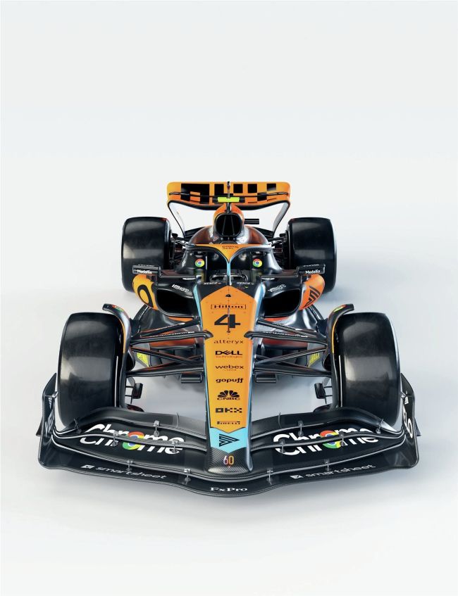
HERITAGE IMAGES/GETTY IMAGES, MCLAREN
But amid a thoroughly enjoyable 40 minutes of entertaining and enlightening snippets, a pattern does emerge from the collage: yes, Stevens does still spot design that appeals. But there’s probably less of it than there used to be, largely because of modern corporate interference replacing an individual vision. Then again, even the bestpresented proponents misfired on looks on occasion – including the man credited with the commercialisation of the F1 car.
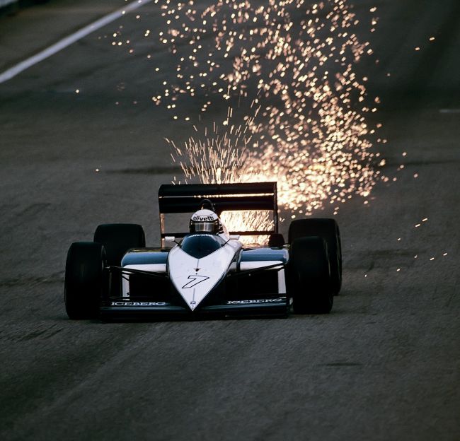
If the sparks didn’t catch your attention at the Österreichring in 1987, then the colour scheme of the Brabham BT56 did
PAUL-HENRI CAHIER/GETTY IMAGES, GRAND PRIX PHOTO, FRÉDÉRIC LE FLOC’H/DPPI, JAMES MITCHELL