POP ART
IN 1985, MANY OF THE MUSICAL ARTISTS THAT WE’D GROWN TO LOVE WORKED ALONGSIDE THE CREAM OF CREATIVE TALENT TO EMBRACE VARIED CONCEPTS AND TECHNIQUES FROM THE ART WORLD INTO THEIR ALBUM’S SLEEVE DESIGNS. HERE, WE DIVE INTO A DOZEN OF THE YEAR’S BEST.
ANDREW DINELEY
B
y
1985, The Smiths were only on to their second album release but frontman Morrissey had already gained quite a reputation for not holding back on his opinions. As with Howard Jones this same year, the subject of animal exploitation became the subject of album tracks for both singers, and for The Smiths, it also informed the title of their much anticipated sophomore album release. The album sleeve of Meat Is Murder was devised by Morrissey and laid out by Caryn Gough.
Morrissey selected an image of US Marine Corporal Michael Wynn, from Emile De Antonio’s 1968 Vietnam War documentary, In The Year Of The Pig for the album’s cover. The original message written on the soldier’s helmet ‘Make War Not Love’ was replaced with the album’s confrontational title and the vinyl version, with its Warholian-style image repetition, only helped to amplif y Morrissey’s message. In 2019, the reluctant cover star reportedly stated that he had never granted permission for the use of his image and that he “wasn’t real happy” that the wording on the helmet had been changed. Morrissey himself spoke to NME about the album at the time, commenting that its title was “a direct statement and it seems to me now that, as the front cover image of the LP hopefully illustrates, the only way we can get rid of such things as the meat industry, and other things like nuclear weapons, is by really giving people a taste of their own medicine.”
Fellow Mancunians New Order were an album ahead of The Smiths with the release of Low-Life, and it proved to be something of a creative revelation for the band. Its sleeve designer, Peter Saville, opted to step into uncharted visual territory by putting the four members of New Order on their own record cover, something they had not done before. This was a deliberate strategy to demystif y New Order, and according to Saville, was due to him growing tired of his previous ‘concept covers’. The close-up photographs were individually shot with Trevor Key, using newly available Polaroid transparency roll-film which produced 35mm images that could be immediately viewed. “You could push it and do funny things with it. It was very graphic and very dynamic.
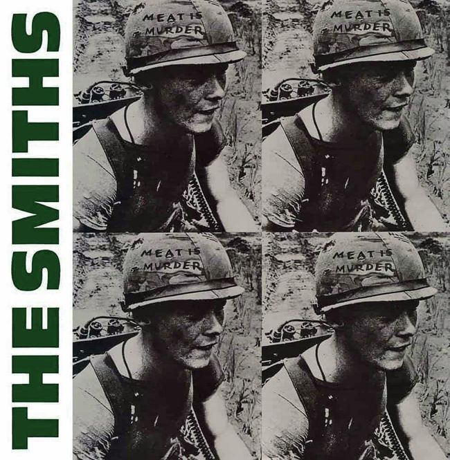
The cover photo for The Smiths’ second LP was taken from a 1960s Vietnam War documentary
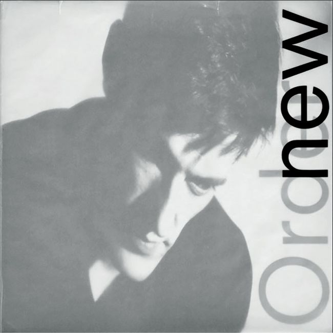
Low-Life
featured drummer Stephen Morris as its sleeve star
The grain and the texture made everything look like a movie film,” said Saville. This was highly appropriate as the sleeve’s typography was inspired by a poster from 1960 for ‘der Film’ by Swiss graphic designer, Josef Müller-Brockmann, even down to the halfcapitalisation of ‘new Order’ on the cover’s overlay. The elegant design came together perfectly with Saville’s oversized typography which was printed onto a wraparound tracing paper outer sleeve that partly obscured the cover images. Pet Shop Boy Neil Tennant heaped praise on the cover art ahead of the album’s songs in his review for Smash Hits magazine: “Firstly, the cover art is brilliant with a very modern tracing-paper overlay. And the LP inside is easily New Order’s best.”